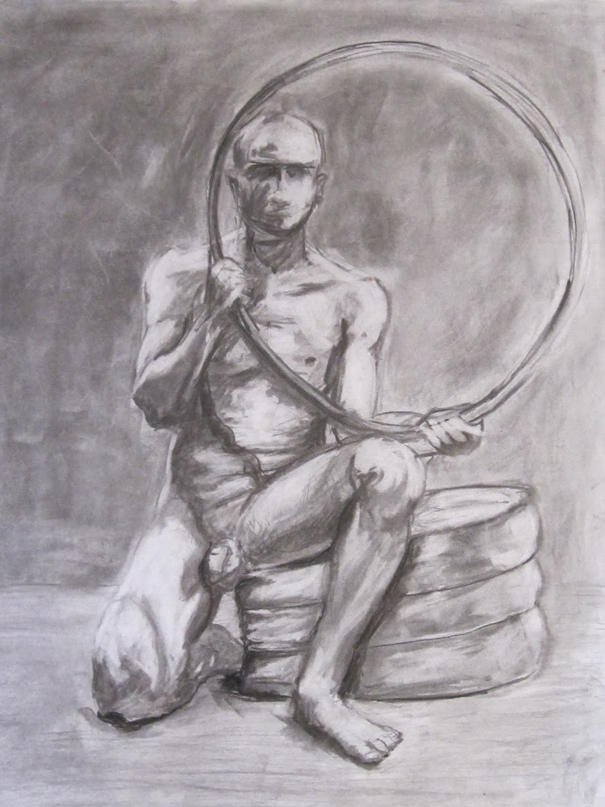
Here is the rest of the drawing projects. I think there is a clear distinction between these drawings and the others. At some point a light seemed to go off, and the understanding of depth started to solidify a little bit.
19x 24 graphite on bristol
Started looking at and focusing on getting the structure correct instead of value. I put some shadows in, but they are really just place holders.
19x20 Graphite on Bristol
Same thing here, less about value and more about structure. and concentrating more on line quality.
19x20 Graphite on Bristol
This was a quick sketch of the drawing room, once again the focus on getting the structure of the room and the people correct.
19x20 graphite in bristol
In this one I started to add value back into the drawings but still the main focus was structure.
Not sure why I added this detail pic in? There isn't anything really exciting going on... lol oh well. I must have thought it important while taking the pic for some reason. I guess the pillows look nice.
Master Study: Paolo Veronese
We were asked to pic a master study and remove all the people and focus on the structure. The weird thing about drawing just the structure of this painting is that Paolo utilized two vanishing points in a one point perspective. You can't really tell with all the people, but when you try to recreate it, you quickly run into it. Lines simply just dont add up. The people in the bottom with christ are on one perspective which ends right at Christs head, while the buildings and structure surround have a vanishing point above the banister in the back.
19x20 Charcoal on Bristol
And here it is without people! I ignored the perspective change here because it looks really funny when drawn with two one point perspectives.
hmm details i guess
more details....
22x35 Graphite on (u know I dont know what kind of paper it is, some very thick large paper)
hmmm lets see, it was intimidating working on a large giant piece of paper. But I ended up liking it. The drawing has moments of goodness.
22x35 Graphite on (same as above)
I like this drawing, I think the structure is very sound, and the feeling of depth is evident.
19x20 Charcoal on Bristol
After doing those large drawings this paper seemed like a post it note. I found it incredibly hard to try to fit everything in! I kept having to redraw the composition. Damn you large paper! You've ruined me!
So there they are. Think this last one turned out well. The lights bother me. but what can I do?
1/29/11
1/8/11
Drawing Part 1
I am really late posting all this, It was.... an interesting break... Anyway, all these photos have been laying around just waiting to be posted. So I figured now is probably a good time to do that since it wont be long before I am knee deep in all my art classes this term.
The drawing class I had last term started off just drawing still lifes. I felt bored at first, almost annoyed, but then the class took an interesting turn, in that, we started to focus on perception of depth, and mark making. These are some drawings from the first part of the class. I post these not because they are good or interesting or anything special. In fact I would rather skip this phase of the class, but I think it offers a good contrast of my growth and understanding of drawing.
So here they are:
A quick Five minute sketch on news print. We were looking at quickly identifying a composition and being able to bang it out quickly.
This drawing makes me want to vomit... my understanding of spacial relationships and tonal value is just... horrid. I hate you drawing!
While slightly better it still is horrid. There is this crumply looking thing in between the bottles. that... is suppose to be a paper bag. Which was LIGHT! when I was drawing it. How it ended up this muddy is beyond me.... failure.
Line drawings and value drawing. While some of it is decent, there really is such a lack of... drawing ability.
Hey its a line drawing, without any variation in line quality... fail
Hey!
While this drawing is sort of good in the texture of it (minus the stupid pitcher that I didnt finish) There still is a lack of understanding in how to... well, everything exists flatly, and there is no variation of value
Hey look apples!
Labels:
Charcoal,
Drawing,
Graphite,
Still Life
11/24/10
Self Portrait
I have been incredibly busy this term, I mean like... zero time. The term is closing in on finished, and I haven't even posted one thing from the current roster of classes. Not only that, but I still have a self portrait from my summer drawing class to post.
I will post soon enough, I just have to finish the time lapse of the self portrait
well shit... maybe Ill just post it now, and then do the time lapse of the drawing later.
hhmmmmm can you call it time lapse if its just pictures of the drawing in progress at random points? Or does time lapse speak directly to the idea that you are seeing actual time tick away albeit in a sped up format?
Well these questions should be left to scientists because I havent an answer.
Here it is, with a slight blue cast to it!
19 x 24 charcoal on bristol
oh wow look at that! its one day before its been a month since my last post!
9/25/10
Android
This drawing started out as just a posed model who was lit. We were asked to take the drawing and transform him into an android of some kind, and whenever I think of androids I think of C3PO, and Star Wars. I decided I wanted to have a whole android scrap yard environment.
The Scrap Yard 18 x 24 Graphite on Bristol
There are some issues with light, but for a first attempt at an environment with multiple light sources I think I did alright. I like the idea of all these small pools of light in a large room.
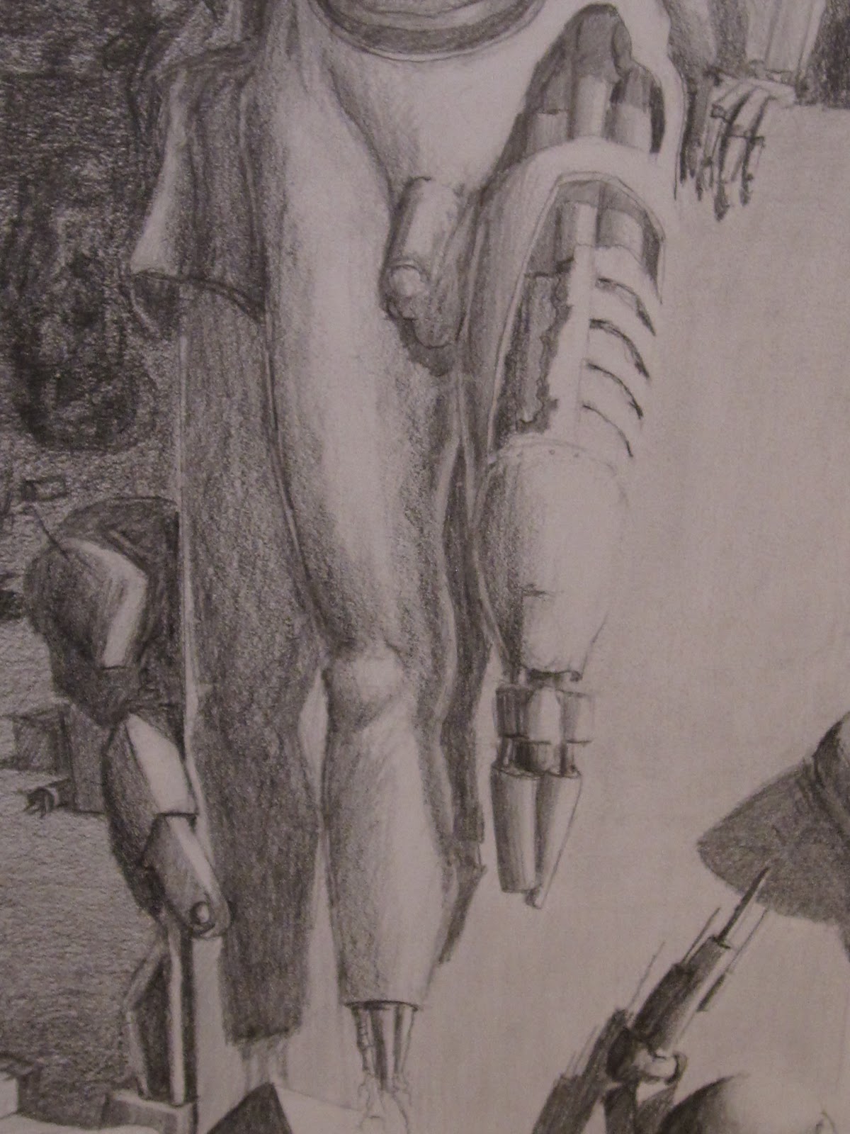
I think one of the coolest things was the amount of detail I found myself adding to the robots.
This wheel guy was pretty fun to come up with, at first he was suppose to be sitting on a scooter or something, but I couldn't draw that, or I was just too lazy.
I chopped off his feet because I didn't want to deal with them.
Look at all the inner workings of this fine machine!!! Why would anyone just let this thing rot on some strings?
Look at that cool looking robot behind that big thing! He has shades on!...but he is obsolete so he is worthless.
Is that a star wars-ish door or what?
I love the hanging figures and the doctors and stuff in the window. But what I love more is that the stairs are like five hundred times the size of the doctors. And why are there doctors? I mean its suppose to be a scrap yard, why do we need doctors hanging around?
Well because they are scientists who just happen to look like doctors of course!
which, I guess leads me to the next question: Why are scientists spending any sort of time doing anything with old scrap?
Labels:
Drawing,
Figure,
Graphite,
Illustration
9/15/10
Lady Laura
Here are a few drawings of Laura from my Summer drawing class.
19 x 24 charcoal on Bristol
who knows how big this is, I jacked this drawing up by placing her too low on the paper. So I cut her out and added a black boarder because I thought that would detract from my poor choices...
This drawing is on blue paper with a light charcoal and white chalk and pencil. I have experimented in the past with white on toned paper and it always turns into a giant mess. This however, turned out to be fairly successful. I actually really like it. I don't know if it comes across as well in a picture than in real life, but I feel good having accomplished a decent drawing with toned paper, charcoal, and chalk.
22 x 24 Light Blue paper, Medium Charcoal, white chalk, Graphite, and White Color Pencil.
A couple of close ups of the body, it is slightly blurry, but I love the way her breast looks in this with that light just ever so slightly catching the top of it. I think I drew her legs pretty well, I also like the way the foot digs into the folds of the cloth
8/30/10
Aged
There is something to be said about the texture of skin as it ages. This lady was incredibly fun to draw. I tried to capture the smoothness as well as the thinness of her skin.
19 x 24 Charcoal on Bristol
CU of the face
Here is another study of the lady. Once again I was fascinated with her skin, and the textures on her coat and shirt. There was some sort of fabric with flowers on it, I decided to leave the print pattern but remove the folds and texture of the fabric. I sort of like the smoothness of the flowers coupled with the roughness of her clothes.
19 x 24 Charcoal and Graphite on Bristol
CU of the Jacket Texture
CU of the Shirt Texture
CU of the Face
8/26/10
Foreshortening, Contour, and Value
Well it is official, I am done with school for the summer! The drawing class ended yesterday and now I get to sit back and enjoy life before the craziness starts all over again. In the meantime here are a few more drawings.
Foreshortened Bill
19 x 24 charcoal on bristol
Value & Contour Self Portraits
24 x 19 charcoal and graphite on bristol
8/18/10
Extracted Forms
For this drawing I covered my paper in a dark charcoal and then used my eraser to extract and lighten the forms. This technique seems to be a bit more like painting than drawing. I was fairly surprised how much variety in value you could get through erasing. You seem to be able to form shapes in a more fluid manner (hence why its more like painting). There are places where I erased too much and had to go back over and darken and try it again but over all this was done in one hour long sitting.
Neanderbill (because the head is a bit big looking, my fault not his, although I sort of like it):
19 x 24 charcoal
CU of the face
Neanderbill (because the head is a bit big looking, my fault not his, although I sort of like it):
19 x 24 charcoal
CU of the face
8/8/10
Recent Work
I finally have some stuff to post from my summer drawing class. These aren't the most exciting pieces but I figure I'll start with the worst of the lot and move up from there.
This was from the first day of class, the instructor wanted us to take our drawings and start drawing circles over the areas that were circles. I liked my drawing too much to just start circling crap on it so I thought I would do an overlay on top of this drawing to get the same effect. Turns out the instructor hated this idea and she gave me an F. I was slightly shocked to get an F, but whatever, at least I didn't ruin a drawing for circles.
Here is the circle drawing
and here they are combined
so you can see the effect of the overlay
some plane studies
this class was pretty weird. We drew a model and then after we were done we were told to go add a skeletal structure underneath it. I found this difficult because the model is slightly in a sitting position. I felt that perhaps we should have had two class periods to work on this project. One of the model, and then one with a skeleton propped up in a similar position. Anyway, the hip is totally out of whack, but perhaps correctness wasn't the main purpose of the project as I didn't fail this one even though it is kind of wonky.
Liked this one, there was no time to plan a composition we were just suppose to see how it turned out and I think it works for the most part.
Hands, I really hate that super dark hand, don't ask what I was thinking....
I do, however, like this rendering of my hand.
My feet, yay...
Subscribe to:
Posts (Atom)