First Pend Drawing. I really love to draw in pen! It is so dramatic. I thought this piece by NC Wyeth would be the perfect mood for my master study.
12 x 16 Pen on Bristol
Close up of the dress
more close ups
Actual painting by NC Wyeth...(well not actual painting, its just a jpg)
Showing posts with label Master Copy. Show all posts
7/17/11
Art Dump of Art Firsts (or fists)
These were just laying around so I decided I should post them, they dont deserve their own entry but perhaps all together they deserve some sort of mention. This is mostly a lot of new media stuff I was trying. Well besides the charcoal and oil paintings of fists, but I had yet to do skin tones (and by that I mean skin tones that were half way human, these are at least getting there)
Boom in your face! Oil hands!
This is a gouache painting on yupo paper. Just for the record I HATE YUPO PAPER!!!, I mean maybe I just didnt understand how to use it with gouache, but it drove me crazy the constant smearing of the pigment. I blamed the gouache at first, but I have since tried gouache on normal FRIGGIN paper and I like that a lot. Actually really like how fast gouache is on normal paper, been working on some stuff, hopefully will be done soon!
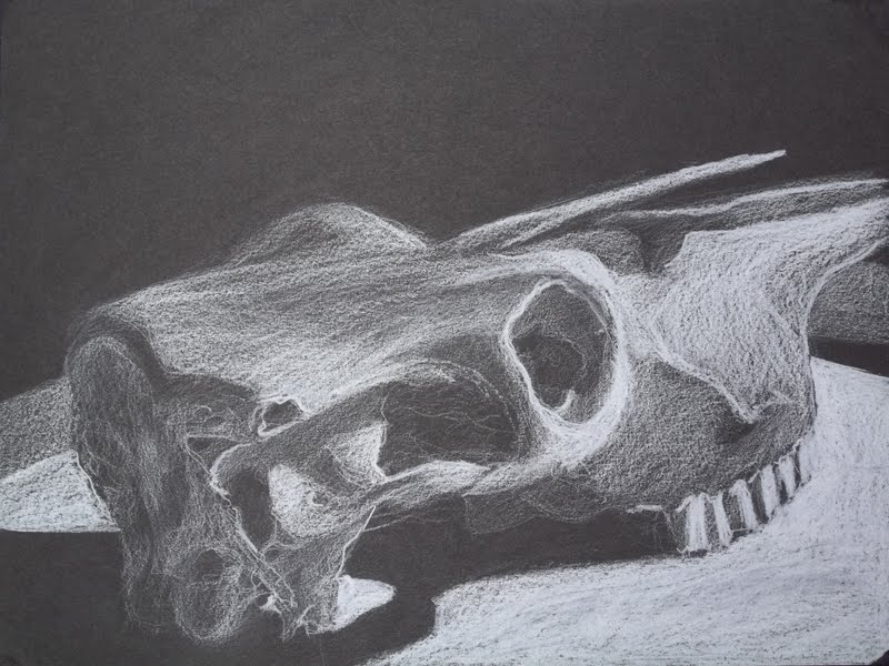
Charcoal skull, black paper... you know... good times, oh wait no this is colored pencil... my bad.
Encaustics, WHO CARES! I really hated wasting my time on painting with wax, im sure some people can get some really nice stuff out of wax painting, but seriously... what a waste of time, nevermind that they arent very good, but I could have spent those two or three weeks actually painting something or actually learning something with OIL paints or any kind of paint... but WAX? ugh, I should melt them down and maybe I can somehow utilize the board underneath.
good bye encaustics you will never be missed.... ever... I promise
Labels:
Charcoal,
Drawing,
Experimental,
Gouache,
Master Copy,
Oil,
Painting,
Still Life
1/29/11
Drawing Part 2
Here is the rest of the drawing projects. I think there is a clear distinction between these drawings and the others. At some point a light seemed to go off, and the understanding of depth started to solidify a little bit.
19x 24 graphite on bristol
Started looking at and focusing on getting the structure correct instead of value. I put some shadows in, but they are really just place holders.
19x20 Graphite on Bristol
Same thing here, less about value and more about structure. and concentrating more on line quality.
19x20 Graphite on Bristol
This was a quick sketch of the drawing room, once again the focus on getting the structure of the room and the people correct.
19x20 graphite in bristol
In this one I started to add value back into the drawings but still the main focus was structure.
Not sure why I added this detail pic in? There isn't anything really exciting going on... lol oh well. I must have thought it important while taking the pic for some reason. I guess the pillows look nice.
Master Study: Paolo Veronese
We were asked to pic a master study and remove all the people and focus on the structure. The weird thing about drawing just the structure of this painting is that Paolo utilized two vanishing points in a one point perspective. You can't really tell with all the people, but when you try to recreate it, you quickly run into it. Lines simply just dont add up. The people in the bottom with christ are on one perspective which ends right at Christs head, while the buildings and structure surround have a vanishing point above the banister in the back.
19x20 Charcoal on Bristol
And here it is without people! I ignored the perspective change here because it looks really funny when drawn with two one point perspectives.
hmm details i guess
more details....
22x35 Graphite on (u know I dont know what kind of paper it is, some very thick large paper)
hmmm lets see, it was intimidating working on a large giant piece of paper. But I ended up liking it. The drawing has moments of goodness.
22x35 Graphite on (same as above)
I like this drawing, I think the structure is very sound, and the feeling of depth is evident.
19x20 Charcoal on Bristol
After doing those large drawings this paper seemed like a post it note. I found it incredibly hard to try to fit everything in! I kept having to redraw the composition. Damn you large paper! You've ruined me!
So there they are. Think this last one turned out well. The lights bother me. but what can I do?
Labels:
Charcoal,
Drawing,
Graphite,
Master Copy,
Still Life
4/11/10
More Models
Here are the rest of the finished full body poses from last terms drawing class. All are done in about an hour.
I like this one a lot, at first I didn't care about it, but I think I handled the jeans pretty well.
19x24 charcoal on bristol
This lady was our model for several of our classes, I got a few good portraits out of her too. I like this image because of all the wrapping and drapery. I probably made the shadow too dark, but whatever.
18x24 charcoal on newsprint
We had to do a master study I chose Paul Cadmus, Untitled Nude, 1945
Here is the original
And mine
20x28 Charcoal and Graphite on blue paper
Labels:
Charcoal,
Drawing,
Figure,
Master Copy
4/21/09
Master Copy
So this is a master copy of one of Eschers drawings. It was the first assignment in my drawing systems class. I think I did pretty well considering I had not drawn anything since my last figure drawing class some years ago.
I started with the bell tower, and even grided the master copy so that I could more easily get proportion right.
This was the wrong way to go about it. I ended up scrapping this approach because trying to copy each square and figure out what the one and a quarter inch squares on the page meant to my two and three fourth inches on my page was just too time consuming. Plus everything was just way off, so I figured I would have better success by just doing an overall drawing and going from there.
The problem with that is that I had already done the bell tower and started working on these small details (which I've since learned to not jump into detail so quickly), and did not want to lose what I had already done. So I just took what I did, finished up the gesture realized there was no way I was going to fit everything from the Master onto my drawing. Yet my gesture was pretty close in terms of where actual lines ended up going down.
I think it turned out pretty good. It is obviously off here and there. I think after I finish putting on the shading some of that oddness will be covered up.
Here is a video of the process
and here is the finished piece (the file is pretty big so you can get a fairly good look at the detail if you click it)
Labels:
Drawing,
Graphite,
Master Copy,
Process Post,
Video
Subscribe to:
Posts (Atom)