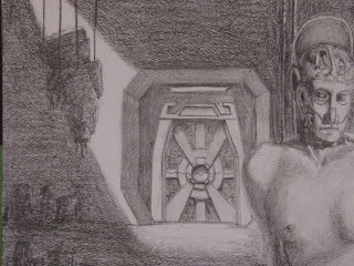
This drawing started out as just a posed model who was lit. We were asked to take the drawing and transform him into an android of some kind, and whenever I think of androids I think of C3PO, and Star Wars. I decided I wanted to have a whole android scrap yard environment.
The Scrap Yard 18 x 24 Graphite on Bristol
There are some issues with light, but for a first attempt at an environment with multiple light sources I think I did alright. I like the idea of all these small pools of light in a large room.
I think one of the coolest things was the amount of detail I found myself adding to the robots.
This wheel guy was pretty fun to come up with, at first he was suppose to be sitting on a scooter or something, but I couldn't draw that, or I was just too lazy.
I chopped off his feet because I didn't want to deal with them.
Look at all the inner workings of this fine machine!!! Why would anyone just let this thing rot on some strings?
Look at that cool looking robot behind that big thing! He has shades on!...but he is obsolete so he is worthless.
Is that a star wars-ish door or what?
I love the hanging figures and the doctors and stuff in the window. But what I love more is that the stairs are like five hundred times the size of the doctors. And why are there doctors? I mean its suppose to be a scrap yard, why do we need doctors hanging around?
Well because they are scientists who just happen to look like doctors of course!
which, I guess leads me to the next question: Why are scientists spending any sort of time doing anything with old scrap?
9/25/10
9/15/10
Lady Laura
Here are a few drawings of Laura from my Summer drawing class.
19 x 24 charcoal on Bristol
who knows how big this is, I jacked this drawing up by placing her too low on the paper. So I cut her out and added a black boarder because I thought that would detract from my poor choices...
This drawing is on blue paper with a light charcoal and white chalk and pencil. I have experimented in the past with white on toned paper and it always turns into a giant mess. This however, turned out to be fairly successful. I actually really like it. I don't know if it comes across as well in a picture than in real life, but I feel good having accomplished a decent drawing with toned paper, charcoal, and chalk.
22 x 24 Light Blue paper, Medium Charcoal, white chalk, Graphite, and White Color Pencil.
A couple of close ups of the body, it is slightly blurry, but I love the way her breast looks in this with that light just ever so slightly catching the top of it. I think I drew her legs pretty well, I also like the way the foot digs into the folds of the cloth
Subscribe to:
Comments (Atom)


